Deep knowledge across the critical disciplines that define effective wayfinding systems.
Understanding how people move through spaces forms the foundation of effective wayfinding.
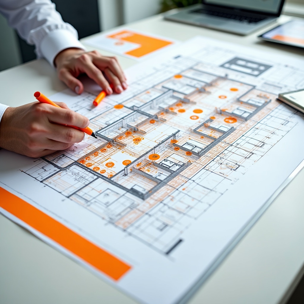
We examine how people naturally navigate your facility—entry sequences, circulation corridors, vertical movement patterns, and destination approaches. This analysis reveals where users make navigation decisions and where confusion typically occurs.
Heat mapping techniques, observation studies, and user interviews help us understand actual movement patterns rather than theoretical paths. We identify bottlenecks, unclear transitions, and moments where users require orientation assistance.
Critical decision points—locations where users must choose between multiple paths—require careful signage placement and information design. We map these points systematically, ensuring each receives appropriate wayfinding support proportional to its complexity and importance.
Not all decision points carry equal weight. Our analysis prioritizes intervention based on traffic volume, user familiarity, and consequences of incorrect choices.
Structuring wayfinding information for intuitive comprehension and efficient navigation.
We develop logical groupings and naming conventions for destinations that match user mental models. Consistent terminology across all signage elements reduces cognitive load.
Identification, directional, informational, and regulatory signage each serve distinct purposes. We establish clear hierarchies determining when and where each type appears.
Signs cannot display every possible destination. We prioritize information based on user needs at specific locations, displaying only what's relevant to immediate navigation decisions.
Users receive increasingly specific information as they approach destinations. Initial signage provides general direction; subsequent signs offer refined guidance until arrival.
Creating cohesive visual languages that communicate clearly while respecting architectural contexts.
Typeface choices dramatically impact readability and comprehension. We select fonts optimized for wayfinding contexts—high legibility at distance, clear character differentiation, and appropriate weight variations for hierarchy.
Font sizing follows viewing distance calculations ensuring readability from typical sightlines. We test typography in actual environmental conditions rather than relying solely on design software.
Color serves both organizational and accessibility functions. We develop color coding systems that aid navigation while maintaining sufficient contrast for readability across diverse lighting conditions.
Color choices consider cultural associations, existing architectural palettes, and accessibility standards including color blindness considerations. Effective systems work in both color and grayscale.
Icons communicate across language barriers and provide quick visual recognition. We design or select icon sets that align with international standards while remaining distinctive to your facility.
Icon systems balance universal recognition with specific facility needs. Custom icons supplement standard symbols where unique destinations or functions require representation.
Strategic approaches to signage that serves diverse language populations effectively.
Determining which languages appear on signage requires analysis of user demographics, regulatory requirements, and spatial constraints. We help organizations make informed decisions about language inclusion based on actual user populations and facility context.
Primary and secondary language hierarchies ensure critical information remains prominent while accommodating additional languages where space permits. Not all signage requires identical language coverage—we tailor language presence to specific location needs.
Different languages require varying space—text expansion factors between English and other languages can reach significant percentages. Our layouts accommodate these variations while maintaining visual balance and hierarchy.
We design flexible templates that adapt to different text lengths without compromising readability or forcing awkward abbreviations. Typography adjustments maintain consistent visual weight across languages.
Accurate, contextually appropriate translations are essential. We coordinate with professional translators who understand wayfinding terminology and spatial context, ensuring translations work within signage constraints.
Terminology consistency across all signage elements prevents confusion. We establish and maintain translation glossaries that ensure identical destinations receive identical names throughout the system.
Beyond literal translation, we consider cultural reading patterns, color associations, and symbolic meanings that vary across cultures. Design decisions reflect awareness of how different user groups interpret visual information.
Icon selection, directional conventions, and information sequencing adapt to serve multicultural populations while maintaining system coherence. Universal design principles guide these decisions.
These focus areas don't exist in isolation—effective wayfinding requires integrating spatial analysis, information architecture, visual design, and multilingual considerations into cohesive systems.
Our advisory approach addresses all these dimensions simultaneously, ensuring recommendations work together to create navigation experiences that feel intuitive and effortless for all facility users.